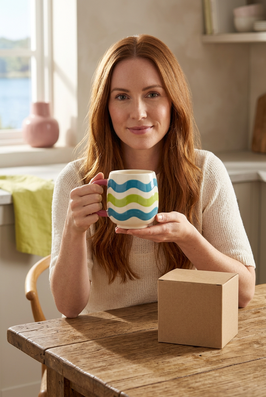
Ripple Pop Mug — Lake-Blue & Lime-Green Wavy Stripes on Cream with a Raspberry-Pink Handle, a Playful Color Statement for Everyday Spaces
Ripple Pop Mug — Lake-Blue & Lime-Green Wavy Stripes on Cream with a Raspberry-Pink Handle, a Playful Color Statement for Everyday Spaces
Couldn't load pickup availability

🎵 Your Table Has a New Rhythm.
Blue, lime, blue. A line rises, dips, and rises again. A raspberry-colored handle steps into the composition from the side. Ripple Pop takes the familiar striped mug in a more expressive direction, trading straight bands for generous waves and pairing cool colors with an unexpected pink accent.
There is movement in the pattern even when the mug is standing still. Three broad bands travel around a cream-colored body, separated by pale spaces that keep each wave distinct. The interior stays cream, the small foot stays quiet, and the handle supplies the warm contrast that changes the entire palette.
This is not a design that needs a slogan across the front. Its personality is already visible in the rise and fall of the stripes, the contrast between blue and green, and the rounded outline beside them. Familiar enough to imagine on your table, different enough to deserve a second look.
🎚️ Turn Up the Color, Keep the Balance
The opening note is lake blue. It appears in the upper wave, where the curve moves just below the cream rim. The blue gives the pattern definition against the pale body without enclosing it in a straight border. As the mug turns, highlights move across the band and reveal the rounded surface beneath the graphic.
The middle note is lime green. Brighter and more unexpected, it interrupts the blue with a fresh contrast. Because it follows the same undulating rhythm, the change in color does not break the composition. It becomes another part of the repeated movement, a vivid center between the two blue bands.
The lower blue brings the pattern home. Returning to blue gives the arrangement a sense of structure. It keeps the green from reading as a separate stripe added at random and creates a clear beginning, middle, and finish. The pale foot beneath it gives the decoration room to stop before it meets the table.
Raspberry is the offbeat. The handle does not repeat either stripe color. Instead, it adds a warm pink outline that makes the cooler body colors more noticeable. It is a deliberate contrast, not another wave competing for space.
〰️ Follow a Wave All the Way Around
A straight stripe describes a direction. A wave describes a rhythm. On Ripple Pop, each broad band moves across the curved body with rounded peaks and dips, making the surface feel lively without filling it with small details. The graphic is readable at a glance, but the changing perspective gives it more depth when you look closer.
The cream gaps are part of that rhythm. They prevent the blue and lime from merging into one large block and allow the underlying silhouette to remain visible. Near the top, the pale rim creates a quieter boundary around the opening. Near the bottom, the small cream foot provides another pause.
Look at the front and the waves appear wide and open. Look toward the edges and they compress as they move around the sides. That shift is a reminder that the pattern belongs to a rounded object, not a flat panel. Color and form work together rather than telling separate stories.

🧿 A Closer Look Beyond the Stripes
The rounded profile
The barrel-like body has a gentle fullness through its middle before narrowing toward a small pale foot. That softness echoes the undulating bands. There are no sharp corners to interrupt the visual movement, and the curved lower section gives the bottom wave a slightly different perspective from the upper one.
The open cream interior
Inside, the palette becomes quieter. The cream-colored interior continues the pale spaces on the exterior rather than introducing another strong accent. From above, this creates a calm central area surrounded by a more expressive outer surface. It is a different view of the same design, not a separate color option.
The raspberry loop
The D-shaped handle has rounded edges and an open center. Its solid pink appearance gives the patterned body a clear side accent without repeating the wave graphic. The loop is visually substantial, but the opening keeps its outline from feeling like a solid block beside the mug.
🧪 Three Styling Recipes, No Matching Set Required
Recipe one: cream + wood + one wave
Start with a natural wooden table and a plain cream textile. Let the mug supply the pattern. This combination brings the cream body into the surroundings while leaving the blue, lime, and raspberry easy to see. There is no need to add another patterned object just to make the setting feel complete.
Recipe two: blue + pink + a little space
A muted blue surface can connect to the wave bands, while a soft pink background echoes the handle without matching it exactly. Leave open space around the mug so the lime stripe has room to stand out. The contrast works best when each color has a clear place rather than appearing everywhere at once.
Recipe three: mixed shelves + one repeated accent
Among books, plain bowls, and a simple vase, choose just one color from the mug to repeat. A green book spine or a pink decorative object can create a visual connection. The rest of the shelf can remain varied. The aim is a conversation between objects, not a collection that looks purchased all at once.
🕰️ Small Scenes from an Ordinary Day
A corner before the day gets busy. Light falls across the table, a chair is pulled out, and the room has not yet filled with activity. Against that quiet setting, the waves offer a small point of interest. The color is there for you to enjoy, not just for a photograph.
A pause away from the screen. The table has a notebook, perhaps a book you meant to finish, and enough space to put something down without moving a stack of papers. A colorful object can help that corner feel separate from the work area, even when both occupy the same room.
A shelf after everything is cleared away. With the handle turned outward, the raspberry loop becomes more prominent. With the body facing forward, the blue-and-lime rhythm takes over. A slight rotation changes the emphasis without changing the object or adding another accessory.
🫧 Playful Does Not Have to Mean Busy
Ripple Pop uses a limited set of shapes: a rounded body, an open loop, and three flowing bands. The color combination is expressive, but the geometry stays simple. That is what keeps the design from relying on dense ornament, a collage of motifs, or a slogan to create interest.
The cream spaces do much of the quiet work. They separate the colors, frame the opening, and finish the base. The raspberry handle provides one unexpected note, then stops. Each element has a role, and none needs to cover every available surface.
🎀 A Colorful Gesture in a Quiet Box
For someone who notices unusual color combinations, the appeal may be in the details: the lime between the blues, the pink beside the cream, or the way a wave continues around a rounded surface. This design offers a gift direction built on that visual character rather than a printed message.
The packaging concept stays neutral: one plain beige kraft-style rectangular box with no logo, promotional wording, or decorative print. It leaves the mug as the colorful reveal and gives you room to choose your own note or wrapping style. Any ribbon, card, food, textile, furniture, or pedestal shown or suggested is a styling element, not an included extra.
📋 The Clear Details
Design and price: one Ripple Pop Mug design, with lake-blue and lime-green wavy bands on cream, a raspberry-pink handle, a cream interior, and a small pale foot. The listed price is $47.00 USD. The illustrated box is plain beige and logo-free.
What the listing represents: one mug, not a set. Close-up panels show different views of the same intended product. No lid, spoon, straw, or saucer is shown as included.
What still needs confirmation: exact capacity, dimensions, weight, final material composition, food-contact suitability, temperature limits, and care instructions. Microwave and dishwasher compatibility cannot be established from these images. Confirm those facts against final supplier specifications before purchase or use of a manufactured version.
How to read the images: the white-background view shows the overall design and box, the hero explores the color palette, the detail sheet isolates the waves and handle, and the model scene provides a lifestyle impression. The model image is not a measurement reference.
🪩 Find Your Color Rhythm.
You do not need to build a whole room around one mug. Sometimes a single object with a clear identity is enough. Ripple Pop brings a flowing pattern, a lively palette, and a familiar rounded shape together without asking everything else on your table to match.
Follow the blue. Notice the lime. Let the raspberry handle change the balance. It is a small composition with more than one detail worth coming back to.
Ripple Pop Mug · $47.00 USD
A little movement, a little contrast, a lot of personality.
Product-development note: all images are AI-generated design visualizations, not photographs of a verified manufactured sample. Confirm the physical product, included packaging, availability, specifications, and care guidance before selling this concept. Final colors, stripe placement, proportions, and surface appearance may differ from the visualizations.